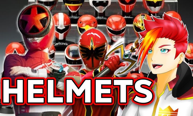
Sentai helmets are a key focal point of the entire franchise’s design and visual aesthetic, so what about them makes them so great? In this video, I want to highlight some of the key points I think are critical in making a ranger team’s helmet iconic and impactful! What are some of your favorite Sentai helmets?
EDIT: Yes, it looks like I forgot to include Fiveman in the Lips/No Lips chart, which slightly alters the percentage but still affirms the point! ☺️
Please LIKE, SUBSCRIBE , and FOLLOW me on Twitter! https://twitter.com/KingZoru_VT
Time stamps:
0:28 Preface
1:52 Shape
3:21 Power Rangers
4:45 Visors
7:27 Mouths
9:18 Magiranger
9:37 Maskman
9:54 Dairanger
10:12 Kyoryuger
10:44 Ryusoulger
11:06 Shinkenger
11:33 Gaoranger
12:12 Conclusion
#powerrangers #supersentai #boonboomger
source


Finally tricked youtube into naturally promoting Sentai/Ranger content onto my recommended, Really enjoyed these videos!
I think my favourites have to be Jungle Fury/Gekiranger, especally with the added white accents, the visors being small and sleek matching the eyes of big cats add an extra animalistic energy that I enjoy a lot
cool
As much as i think every super sentai helmet is peak design, i still think that the lips in some of them kinda take some points to me, my favorite designs are usually the ones that have the "mouth piece" be flat or look stylized, like DonBrothers, i love the mouth piece in their helmets so much
Zyuranger, Megaranger, Maskman, Zyuohger. There is no competition
Sorry, Donbrothers might have lips on the helmets but like with anything from the different species, yet it doesn't matter.
And one more important thing:
Always have the shutter mouthpieces on the Super Sentai helmets instead of the human mouth shaped(Battle Fever, Staceasar and Donbrothers are exceptions).
Mouths in the helmets to me always added a sense of mysticism to the design. They remind me of the faces on religious statues.
Your top choices are trash. Give me minimalistic helmets any-day. The helmet should only be an adjacent to the aesthetic of the overall suit. Overuse of patterning or sashes make the whole team look goofy, even if it’s themed to the team. Wildforce was the first team design I truly hated with a passion. Mmpr to time force was a great time in minimalistic suit design.
Sees title
Glares at Boon Boomgers' helmet
Sorry, but the helmet with a rim of a car just looks stupid.
Both are kinda mentioned in the video but
My favorite Sentai helmets are the ones that are animal/dinosaur themed, where the animal's jaw is the visor. The best example of this being Go Busters with the jaw being sunglasses, encapsulating the spy and animal motif which is played into this with the Dobutsu Sentai special, giving them fangs
Another type that I'm partial too is when they get really creative with the visors; Ohranger making them shapes, Magiranger's looking like the animals the rangers are based off, and of course Shinkenger's kanji, they're very minimalistic in that way as the helmets don't have much going on with them otherwise but the visors make up for that and less is more
These Sentai helmets are also popular among Power Rangers fans too. I owe it to Super Sentai for making the Power Rangers what it has been for 30 years. My favorite helmets include Zyuranger/Mighty Morphin, Megaforce/In Space, Dekaranger/Space Patrol Delta, Boukenager/Operation Overdrive, Go-onger/RPM, and Gokaiger/Super Megaforce.
Heyo dude
I just wanted to say that I love your avatar and it reminds me a lot of infernoble knights ( Oliver ) from YGO
Hope you're having a good day
Mystic force is my favourite by far and the newest ones are the worst. Wheel faces? Really? Sigh
my mAAAaan
I’m a little upset that OhRanger didn’t get a bit as I think they’re one of the few that has lips that are the same color as the helmet. I’ve really come to love their helmet designs.
Maskman is my favourite suit of the 80s. It's around this point that Sentai suits became more or less what they'd be for the next three decades.
this video is so good and deserves more subs and views honestly
My favorite helmets are Shinkenger Zyuohger and King Ohgers
Fiveman’s helmets (along with Fiveman as a whole) are very underrated.
My guy, talking about Shinkenger being unique for using Kanji for their visor. Gokaiger literally made a joke about their helmets by having Marvelous mix up Ohranger's KingRanger for one of them since it used Kanji for a mask visor ages beforehand.
I usually don't like the lips, but it's an exception in goseiger's case. the uncaniness fits so well with the over-the-top angelic theming.